You Are STILL Not The User


This week I am reprinting a classic from the Nielsen/Norman group about the dangers of using internal consensus as a stand-in for actual research and testing. This is a classic mistake, usually committed by product people who have backgrounds in sales and marketing instead of research and/or engineering. But it is not limited to them: even experts in user-centered design can fall prey to this effect. It’s important, then, to make sure that assumptions about a product’s use and functionality be continually validated by testing and observation.


Post originally written by NN/g researcher Raluca Budiu on October 22, 2017
By now you probably have heard the phrase “you are not the user”  — it’s become one of the mantras of user experience, and rightly so. All our work as UX professionals stems from the assumption that we are different from our users. Artifacts that are right for us are not necessarily right for our users: we can’t judge user-interface quality based on whether we like a design ourselves. We need to learn how to create systems that are right for those who will actually use them.Assuming that you are your user is a fallacy that is ingrained in the human mind. It even has a name in social psychology — it’s called the false-consensus effect.

The False-Consensus Effect

Definition: The false-consensus effect refers to people’s tendency to assume that others share their beliefs and will behave similarly in a given context. Only people who are very different from them would make different choices.

The false-consensus effect was first defined in 1977 by Ross, Greene, and House. They showed that unlike scientists, “layperson psychologists” (that is, all of us who are put into the position to guess how others would behave) tend to overestimate how many people share their choices, values, and judgments, and perceive alternate responses as rare, deviant, and more revealing of the responders.

Ross and his colleagues ran a series of experiments in which participants had to estimate what percentage of people would make one of two choices: for example, what percentage of people would choose to contest a speeding ticket in court versus just pay the fine. After they made their estimate, participants disclosed what they would do in that situation, and also filled in two questionnaires about the personality traits of those who would make each of the two choices. The researchers discovered that participants expected (1) that the majority of people would make the same choice that they made (e.g., pay the ticket), and (2) that those opting for the alternative would have different, more extreme personality traits than those opting for their choice.

We tend to assume that our next-door neighbor has voted for the same candidate that we did in the last presidential election. Only someone who is very different from us — living in a completely different part of the country, from a different socioeconomic class, with a different education — could have voted for the other candidate. Or so we think.

These assumptions are natural. The human mind makes inferences based on one or few examples: if our ancestors were attacked by a wild beast, it would make sense to assume that the beast was dangerous and stay away from it even in the absence of other examples.

Generalizing based on the examples available is a called the availability bias and is a type  of cognitive bias. (Others include negativity biasloss aversionnarrative bias, and framing — which is a type of priming.)  It is often a source of stereotypes and overgeneralizations. As my yoga teacher put it, with those Eastern European roots, I should have no problem with back bends — as if all Romanians were Nadia Comăneci.

Why You MUST Test

Much in the same way, we, designers, developers, and UX researchers assume that people who will use our interfaces are like us. We have one example of someone using the interface: it’s us. And maybe our colleagues. And we make generalizations based on that example. So only someone who’s stupid or very different than us could actually fail to figure it out.

Wrong. We are wrong believing that, but it’s important to understand that we are no worse human beings for doing so. It’s deeply weaved into our nature to believe that others are like us.

So what’s a fallible human being to do? And how about a fallible designer or software developer? The answer is simple. Learn about this bias. Acknowledge it. And then do something to overcome it. When it comes to user interfaces, the answer is simpler than in other avenues of life: Test. With real users (not your colleagues).  Know who your users are and how they respond to your designs by watching them use these designs. Don’t make assumptions.

UX researchers are also subjected to the false-consensus effect and the availability bias (and to many others ). Much of our qualitative work involves looking at a few users and one design, and then making inferences to other similar, but not quite-the-same situations. Or applying heuristics and the knowledge that we’ve acquired to new paradigms. It’s important to understand that these inferences can be biased — we may be wearing blinds. Often what works in one situation may not work in others, and vice versa.

Acknowledge your vulnerability and establish checks. Don’t validate; instead investigate. Study with your actual target users whenever the slightest doubt is involved.

WTF DesignOps?

A guest column by Fabricio Teixeira about another trend in digital product design (courtesy our friends at AirBnB): DESIGN OPS. What exactly is it? Does my company need it?  And where do I fit in?

Photo by Tim Gouw

As design teams scale within organizations, our industry starts to turn the spotlight to DesignOps, a new nomenclature for an old profession that is becoming increasingly important to create great, consistent, and efficient work. But what does DesignOps mean for startups and small design teams?

Before we start… what is DesignOps?

It is the department that plans, defines, and manages the design process within an organization. Their goal is to ensure the design team becomes a well-oiled machine, functioning at high efficiency, low friction, and generating high-quality design outputs.

The term DesignOps (or DesOps) has been around for at least a few years, and is clearly a spin on DevOps (the discipline who does the same for developers). Even before the term DesignOps came about, the role itself already existed. Back in the day, it was the title given to PMs that were more focused on processes than projects.

The focus of DesignOps is to keep the design team healthy, running smoothly and efficiently. To achieve that, they take care of a few different aspects of a team:

  • Workflow: how the design workflows within the company
  • Tools: what they need to get the job done
  • Governance: who needs to see the work, and when
  • Infrastructure: what the team needs to work more efficiently
  • Budget: how much running that team costs, and why
  • Headcount: how many people are needed, with which skills
  • Pipeline: projects coming up and how well staffed the team is
  • Retention: how to make people want to stay
  • Education: what skills are missing and how to learn them
  • Evangelization: help the org understand the value of design

They can operate at company-level and project-level. The former is about looking at design staffing holistically; the latter is about understanding each project’s specific needs and challenges, to adapt all the aforementioned pieces accordingly.


Why are people talking about DesignOps now?

Because design teams are growing. Because the role of design within organizations is growing. The number of teams designers serve is growing. Multi-office work, remote work, and distributed teams are growing. Design solutions and products are growing in complexity. Nothing has changed in terms of what DesignOps is and what it does. You’re just going to start hearing about it more often the more companies grow.


What does that mean for my startup? Do I need to hire a DesignOps person?

Let me start with an important distinction here.

There’s DesignOps-the-mindset, and there’s DesignOps-the-role.

Every design team with more than 1 person needs some form of DesignOps thinking, simply because you want to make sure designers are not working in silos. If you’re looking for higher quality and efficiency in your design process, it’s important that your designers share the same tools, templates, and workflow, for example. Making sure there is a clear naming structure for files and folders, for example, will end up saving you time when you need to go back and find an old file in your servers.

Having a “DesignOps mindset” in your team is important, no matter how big your company is. It creates efficiencies in the long run, and generates more consistent work.

Now, whether you need to hire a dedicated DesignOps person? Well, that’s a different question.

  • You’ll probably only need to hire someone when your design team headcount surpasses 40–50 designers;
  • That might happen earlier in case your team structure is too fragmented, or if you have distributed teams;
  • That might happen later if your design managers already take that responsibility on;

Making sense of the ever-increasing complexity of product design

The products we build are becoming increasingly complex; our internal methodologies more sophisticated; our teams bigger and more diverse in terms of skillset and technical expertise.

For that reason, companies like Airbnb have been perfecting the science of DesignOps in the last couple of years, and pioneering the use of new technologies to enable a more efficient process.

“Working daily across so many disciplines, from Engineering to Product Management, Research, Content Strategy and an array of Design specialties, every little overhead in the transfer of information compounds. Inversely, every optimization significantly lowers friction for everyone. This is why we’ve created DesignOps, to ease collaboration and amplify effectiveness, not only across product disciplines, but also between the increasingly complex world of Product Design.” — Adrian Cleave, Airbnb

Airbnb’s most famous example of an integrated and seamless process is their AI-assisted design tool that turns hand sketches into code in a matter of seconds. The vision that drove the creation of the tool is that the time required to test an idea should be zero, and it is a perfect example of some of efficiency and integration DesignOps can bring to an organization in the long run.

The answers that a DesignOps mindset is always pushing for:

  • How can you equip your team with the right tools, infrastructure, training, and governance they need to create high-quality work more efficiently?
  • How do you integrate Design with your other teams and make it a central piece of the puzzle? How do you facilitate communication and documentation between different groups, without creating extra work?
  • How do you create efficiencies across every step of your workflow? How do you reduce time? How do you eliminate unnecessary steps? How can automation technology support that?

So, while your company is still a small startup, you probably don’t need to hirea dedicated DesignOps person right now.

But you should definitely start incorporating a DesignOps mindset into everything you do. The earlier, the better.


Positive Reinforcement In UX Design

Positive Reinforcement In UX Design

Recently, I was asked to summarise UX design in just one word. It felt like an exercise in futility – I have always maintained that UX design is a complicated, sometimes convoluted, amalgam of differing industries, skill sets, and disciplines.

I still do not think I have a definite answer, but there was one word I kept returning to – interaction.

Interaction is so inextricable from a platform’s UX design that the term “interaction design” is sometimes used as a synonym (though there are some willing to argue the semantics).

Poorly designed graphic aside, interaction design is key to UX (Image source: Interaction Design Foundation)

Too often we describe the user experience as monolithic — a seamless, fluid, uninterrupted entity. In reality, that is not the case. A user experience consists of thousands of minuscule exchanges between user and platform.

That is right: the fundamental unit of UX design is an interaction. That is why I find the word to be such an apt embodiment. So how do we create “good” interactions? If you are looking for the simplest way to do it (and as UXers, we always are), then look no further than positive reinforcement.

What Is Positive Reinforcement?

When you think positive reinforcement, you might think of Pavlov’s dogs, the famous behavioural psychology experiment. It was Pavlov who coined the term “reinforcement” after he was able to condition dogs to salivate at the ring of a bell.

I am sure you are familiar with the story. It is the archetypal story of classical conditioning, and the mechanism behind it was positive reinforcement. Pavlov rewarded his dogs with the ring of the bell and was able to form a habit (salivate) from it.

In short, positive reinforcement is only encouraging an action by rewarding it. If you mow the lawn, I will give you $20. If you hit 30k in sales, your commission rises. In short, do X and receive something good.

How Do I Use Positive Reinforcement In UX?

In the UX world, we can use positive reinforcement in two ways. The first, if you are employing an unconventional design feature, a non-traditional navigation, or unfamiliar architecture, you can train your users to utilise it and master it by rewarding their interaction with it.

The second, and much more widespread, application is to impose it on the platform as a whole. You are not forming a particular behavior or habit. You simply want to encourage continued and repeated use of the website or mobile app in general.

To accomplish this, think back to interactions, the base unit of your platform. Try to positively reinforce the key ones by rewarding the user when they complete them, ultimately cultivating a more engaging, enjoyable experience.

These rewards do not have to be lavish or complicated. They may be as simple as giving the user a clear, concise confirmation that they have completed the interaction successfully.

(Image source: Quora)

Let the user know when the form they have filled out was submitted without issue. For ecommerce sites, inform shoppers that an item has been successfully added to the cart with a short animation or overlay, or let them know what stage they are at the in checkout process with a progress tracker.

Rewards in web design do not have to be fanfare or relentless, back-patting “great job”s. In UX, the best currency, and thus the best reward, is often simply information.

The Wrong Kind Of Reinforcement

It is important to discern the difference between positive reinforcement and just providing positive feedback. Do not inundate the user with pointless, saccharine pop-ups congratulating them for every action. It could come off at best annoying, and at worst condescending.

Additionally, do not refrain from informing the user when they have made a mistake. Making error messages obvious, and offering a solution, is actually positive reinforcement. Do not coddle the user. Merely point them in the right direction.

Finally, since we have spent so much time discussing positive reinforcement, I would be remiss if we did not at least address the other side of the coin: negative reinforcement. If positive reinforcement is “do X to receive something good”, its counterpart can be thought of as “do X to stop something bad”.

Negative reinforcement means that “something bad”, that consequence, is already present and affecting the user. Its removal is the motivator behind the action. And while it does work in some applications, it fails in the UX domain.

Do not purposefully sabotage the user by inserting a consequence, obstacle, or otherwise malevolent component to your experience to motivate them or change their behaviour. Users are fickle – they will immediately abandon the platform.

Conclusion

Positive reinforcement is the mechanism behind positive interactions, the building block of your user experience.

Each interaction the user makes with your platform, no matter if it is as seemingly inconsequential as typing into the search bar or a major process like onboarding, is another brick in the wall of your experience.

I am not saying you should run to your developers and have them pore over every pixel, optimising every interaction with a positive reward. But you should consider reviewing interactions in key processes like checkout, onboarding, or conversion, and optimising them with positive reinforcement,

Another Railway UX Article


Bad UX is all around us.

I guess I am not the only one who notices UX fails in everyday experiences. This is a column by  from Febrary, 2018

I travel by the Mumbai local train every day, and often take the metro. Millions of people in Mumbai do this too. The commute is such a mundane part of our lives that we do not stop to think how an outsider would feel about the chaos that we have  internalised over years of (bad) experience. From what I can guess, they would be confused at best and frustrated at worst.

If I were to describe my morning commute, it would sound like this:

I take the 8.08 Churchgate-bound slow train from platform number 2 in Borivali. Alight at Mahalaxmi and take bus number 154 to my office.

Now this is a normal part of my routine. If you are new to the city you’d know just two or three of the parameters required to reach your destination. The gaps in information should ideally be filled by the system through UX design. A good user experience design helps a user achieve the desired goal with minimal effort. In case of a commute, a user’s goal is to go from point A to point B. It is criminal to assume that the user would know anything more than what point A and B are.

Unfortunately, the local trains in Mumbai, and even the metro, fail spectacularly in addressing this.

I recently traveled to Europe. I was worried that it would be an arduous task to ask for directions in a language I wasn’t very comfortable in. But I was blown away by how convenient the Paris Metro was for complete novices, even though it was built over 100 years ago. It has its problems (it is slow, old, unreliable and smells like piss) but ease-of-use is not one of them.

Coming back to Mumbai…

Umm.. where’s the platform?

So, you have to undertake the train part of my daily journey at some other time of the day. The difference is that you just know you have to board at Borivali and alight at Mahalaxmi. Nothing else.

All right? let’s get going.

You’ve reached Borivali station after fighting your way through a traffic jam of auto rickshaws, BEST buses and for some reason, roadside food stalls. You see Borivali written in huge letters outside assuring you that you are at the right place.

Welcome to Borivali!

You enter the station, buy your ticket to Mahalaxmi. All good. Let’s get to the train. This is when you are hit with your first question: “Where the hell is my train?”

Once you enter the station you are greeted by an indicator on a tiny monitor. Mahalaxmi is nowhere to be found on it. If you are lucky, it might even be working.

Electronic indicator at Borivali Station. Figure it out yourself.

All right, so there are trains to Churchgate, Virar and so on. Some have “S” or “F” written next to them. You think: “What the hell is that?”

Herein is problem number one. There is no way a user can guess where her or his train will arrive without knowing all about directions, slow and fast trains, and where the platforms are.

This is how Paris Metro solves a part of this problem. All stations on a route are listed before one enters the platform.

By Clicsouris (Own work) CC BY-SA 3.0 , via Wikimedia Commons

They don’t have the slow/fast complexity in Paris so we’ll have to figure it out ourselves. Also they don’t have unscheduled platform changes.

Let us assume you somehow figure out which platform number to go to. You get to your platform, that is, platform number eight (for which you had to walk the length of two platforms). You find a relatively empty spot on the platform. The train arrives, but you’re told you can’t enter this coach which makes you think: “Why the hell can’t I get in this coach?”

There is no sign to show that the empty spot you found on the platform is where the luggage compartment of the train stops. You’re made rudely aware of this fact by the rushing dabbawalas exiting the compartment with their large trays. But wait. That’s not it. It could have been any of the other compartments you are not allowed to enter but don’t know the stopping positions of:

  • Handicap
  • First class
  • Ladies
  • Ladies first class

This is problem number two. A user has no way to guess where her or his compartment will be. The only indications are the coloured bands on pillars. Red and yellow for first class, green and yellow for ladies. How on earth will anyone guess what those colours mean?

Alright, there are some signs to tell you that you have to enter any of the general or second class compartments, but it wouldn’t bankrupt the railways to put out clear signs.

Anyway, now you know that you belong with the unwashed masses in second class. So you accept it, and try to find a place to sit. You settle for the “fourth seat” that you are immediately asked to vacate by an 80-year-old relic of a man. As your ego is at an all-time low from the embarrassment of being so clueless, and the subsequent shoving and pushing, the stations go by, the train gets full and suddenly you are hit with another realisation: “Where the hell am I?”

You are stuck between bodies who interfere with your line of vision that has to pass through a tiny window with grills, or the door, towards a small board with the station’s name written in three languages.

Man for scale. Too bad if your first language is not Marathi.

This is problem number three. A new user would never guess when their destination is about to arrive if they cannot see where they are.

Compare the size of the board in the photo above to the one below in the Paris Metro. The whole board above is as large as just one letter in the picture below.

Seats for scale. The name of the station is clearly visible from anywhere inside the train.

To be fair, the trains and metro have really tried to solve this problem using two methods:

  1. Announcing the next station and final destination in three languages (English, Hindi and Marathi).
  2. LED display boards indicating the next station and the final destination like the following (though dysfunctional) board in a train.

Unfortunately, not all trains have working announcement systems or display boards as the one in the photograph above. I guess it is not worth stopping operations of an entire train just because the display is not working.

After all this, if you still managed to disembark at Mahalaxmi and not Churchgate, congratulate yourself. Count your stars that you don’t have to figure out where is East or West.

You survived like the millions of others who survive Mumbai everyday.

Phew.

One can argue that designing the local train system for a better user experience, especially for newcomers, is not the most urgent matter. However, a team of artists recently decided to decorate Borivali station with some graffiti. It looks like this now:

Photo credit: Making A Difference Foundation/Facebook.

Good job, but too bad that can’t change the horrible user experience design. I would have been happier if they had put some signs on how to reach platforms number seven and eight.

For a newbie, all this can be solved by just “talking to people” but if this was an app meant for regular use, which required asking regular users to understand it, it would never have regular users in the first place.


Disclaimers and notes

  • These were just some general observations. There are specific problems like there are no directions whatsoever how to get to platform eight and nine in Andheri, or the utter chaos in junctions like Dadar. You just have to know or stumble around to find your way.
  • There are many reasons that mess up the user experience design, like sweaty armpits of fellow commuters, shitty ads and inexplicable delays. I just wanted to talk about the ease-of-use part in this post.
  • I know I’m comparing local trains to the metro but the local trains are the biggest mode of transport in Mumbai. They desperately need a redesign. The Mumbai metro has its own design problems but they are not as pronounced yet because there’s just one active line right now.

How can Agile and UX play well together?

kinder-playmates-7

Over the past few years, I’ve been a lead UX designer in an Agile environment. To clarify what I mean by this, I’ll define Agile as a specific development framework designed for rapid iterations of functional software. This is accomplished by the use of two-weeks sprints where developers will tackle a particular user story with a chunk of software. When I worked with Salesforce, we were doing a custom implementation for a client who had a lot of specific requirements that were not immediately met by the out-of-the-box solution. The Agile approach was to break each specific element of the software into a user story with its own requirements and functionality. Each user story was assigned a velocity to determine how quickly it was to be accomplished, with all of the various user stories in the sprint forming part of a larger picture called an Epic. The software used for keeping track of this was Rally, one of the better Agile tools out there.

At Caterpillar, we were building a portal for the various dealers to manage their machines, parts inventories, repair orders, and so forth. There was also a need for the dealers to keep track of their customers. All this was built on the IBM Websphere Portal, a java-based platform of immeasurable complexity that has been the backbone of many American enterprises for years. The product owner and scrum master were based in the US, while the development teams were all located overseas. The tool used for keeping track of all this was Pivotal Tracker, another good Agile organizer.

So where did UX fall in with this? In neither case was it baked into the process, mostly because there was inadequate understanding of the role of UX in the process. A proper User Experience methodology relies on a lot of research up front as well as plenty of validation and testing throughout the process. The ideal is to not waste time designing and building things that don’t work for what the customer wants to do. This is vastly different than building functional software, which only needs to be able to perform the tasks it was designed for to be judged a success. I think of it like this: Agile is all about building working software quickly, and UX is about quickly determining what software will work.

In the case of Caterpillar, there was really no way to do any pure UX other than to observe the dealers wherever possible and ask them questions about the sort of things they did day to day. In this, I was able to help prioritize what the portal needed to do in context (for example, it was important that the rental portal have a mobile component that would allow the dealer to visibly inspect equipment and take pictures as necessary.) Largely, the job became more about applying UI best practices to a complicated interface.

In the case of Salesforce, a lot of the UX research was done up front and throughout the sprints. Development and UX were done in tandem with lots of field studies and specific task and journey mapping that allowed the users to access what they needed in the context and time frame most useful to them.

The biggest takeaway from my experience is that UX needs to be at least one sprint ahead at all times, and more if it’s possible. It also helps if UX is brought in from the onset of the project with a clearly established role and timelines.

During a recent Nielsen Norman Group training, I came across a great case study that I present here as an example of how UX and Agile can be integrated effectively throughout the project:

Doing UX in an Agile World: Case Study Findings

by HOA LORANGER on May 26, 2014

Agile development processes are popular among programmers, and for several years we have studied how to best integrate Agile methods and user experience methods to create great products that don’t abandon usability while chasing after speedy programming. Our earlier research considered the broad perspective, so we now dive into a smaller number of projects to collect deeper insights for our new course on Lean UX and Agile.

I recently interviewed eight professionals who work in Agile environments to learn about their journey, their successes and failures. I spoke with people ranging from User Experience (UX) designers to developers and product owners. All worked in an Agile environment for at least two years.

Agile Is Here to Stay

There is no going back. Everyone that I spoke with admitted that the process is not always smooth, but today it is much better than when they first started several years ago. Even at the 2-year mark, some people confessed that it’s not all roses, but it’s much better than it was before—no one wanted to revert to a traditional development process such as the waterfall.

In general, Agile teams agree that this framework facilitates transparency. Issues are identified sooner and features are delivered faster. Gone are the days when developers and designers spent months and months cranking away, working independently, and only identified issues at the end. Agile has minimized last-minute surprises and allowed developers to predict timelines more efficiently.

“We are working smarter. No more 14 hour days for an entire month. We are a team and we are releasing more often… Since we’re working with smaller chunks that are not monolithic, it is easier to predict than something that is huge and can take 9 months. Everyone is aware of progress sooner.” Victor, Software Engineer

“Before Agile it was harder to stay on track. There is more accountability now. Things are more transparent.” Anca, Software Engineer

Practice Makes Perfect

After a few years of trial and error, Agile teams are getting the hang of it. People are better at timeboxing or setting time limits on activities. Daily standup meetings that used to go on for 30 minutes or more are now getting closer to 15 minutes. Team members are better at being concise and sticking to the agenda. There is a greater understanding and appreciation for the “rules” and how the process benefits releases.

Time estimates are more accurate. In the early days, some teams took on more than they could handle insprints (or units of time), but today this is less of an issue because they have learned what is reasonable work for a given sprint.

“The awkwardness is wearing off. People had to get used to the funny way of calling things and the new activities.” Michelle, UI Designer

Communication Is Key

For some team members, the biggest benefit to using Agile is communication. The Scrum method provides the structure for cross-functional team members to contribute ideas, share responsibilities, and refine the process together.

“The biggest advantage to Agile is retrospectives. It allows people to air dirty laundry, improve, and try different things… At first I was very focused on following the rules. After working in different Scrum teams, I’ve learned that I have to work for those teams… Now we have a shared vocabulary, a shared understanding.” Jeff, Product Manager

“The value of scrum is conversation. Don’t beat yourself up over following all the rules. We do as much as we can.” Cathy, Product Owner

Agile Challenges Within Organizations

For many people the Agile road is still bumpy. Gaining company-wide support has been an uphill battle. Teams must work hard to show nonbelievers the value of Agile and encourage them to break out of their comfort zones.

Lack of Executive Support

One of the major challenges with Agile is getting support from the top. Some of the people I spoke with expressed their frustration with the lack of engagement with management. Without executive backing, teams are forced to cut corners and work less effectively. Misunderstandings about the Agile process result in communication breakdown and incoherent planning.

“Requests from stakeholders that are outside of Agile mess with sprint planning.” Julia, UX Designer

“We’ve had to work on stuff that is not part of planning.” Cathy, Product Owner

“Our group is embracing Agile, but our organization is not there yet. We’ve had a couple of Agile coaches, but the coaches were not great at swaying senior management. They didn’t have an impact to get senior management onboard.” Mandy, Senior Programmer Analyst

Inadequate Resources

The lack of executive support usually results in diminished resources. The practitioners I talked to agree on the merit of Agile and Lean methodologies such as Scrum. Each Scrum component is structured to address a process need. Some of the most successful projects occur when teams can commit to the methodology. However, almost everyone I interviewed didn’t follow the recipe or was forced to take shortcuts. The main reason: lack of resources.

Absence of User Research and Usability Testing

Our Agile panelists agree on the importance of validating designs. Unfortunately, most teams don’t conduct user research on a consistent basis, if at all. People cite tight deadlines and staffing shortages as reasons for deficiencies in user-centered activities. However, discount usability methods can accommodate short timelines as needed.

Skipping user research is extremely risky. Even the best design ideas are just assumptions. There are limits to a genius designer. User research allows us to test our assumptions and prevents cognitive bias from taking over and leading us astray.

“We work under internally imposed deadlines and sometimes need to push things out without testing, which is suboptimal for users.” Julia, UX Designer

“It’s really hard to make usability testing happen. We are short-staffed and don’t have a primary researcher. We’ve borrowed someone from marketing, but he doesn’t know the product enough or abide by our philosophy of ‘we love our users’.” Julia, UX Designer

“We don’t have time to run user testing.” Victor, Software Engineer

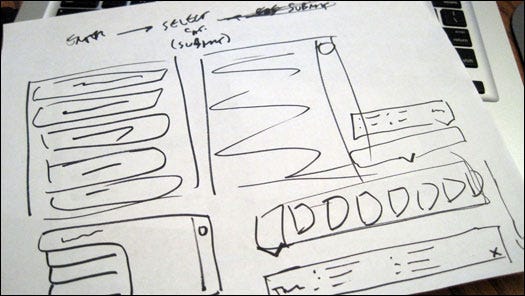
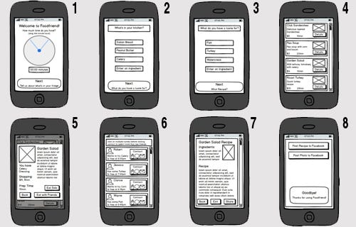
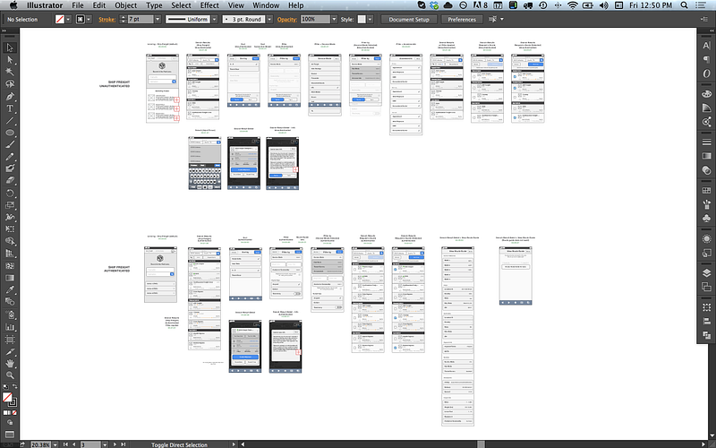
The good news is Lean UX techniques such as sketching, wireframing, and paper prototyping have gained support. Designers are encouraged to create low-fidelity prototypes as a way to demonstrate ideas and reduce heavy documentation. The downside is that many organizations are not testing them with target users.

“We try to be somewhat lean. My boss is encouraging us to not use wireframes—go with sketches. It was a difficult transition. People joke of me being a wireframing addict. Sketches helped me understand the idea of what we are all thinking.” Julia, UX Designer

“We’ve been doing quick and dirty paper and drawing mockups and collaborating with development more.” Mandy, Senior Programmer Analyst

Tips for Running Smooth UX Agile Teams

Keep Teams Consistent

It takes time to build a good, cohesive team with the domain knowledge to make the right decisions quickly. Each Agile team may work differently and have a unique team dynamic. Disrupting the system wildly interrupts velocity because knowledge and expectations must be reestablished.

“Team consistency is key. Stop reorganizing and shuffling people around. Teams that stay together, learn together, and keep getting better and faster.” Derek, Lead Researcher & UX Designer

“It’s a challenge for me because resources are not dedicated. One week we have this person; next week we have another person. We got an Agile coach onsite but if everyone doesn’t get the training or stick to a project long enough, then you have to start over again when you get a new person… Don’t move people back and forth between Agile and waterfall.” Michelle, UI Designer

Be Proactive Not Reactive

If you are used to working “head down” for long stretches of time, then you need to change your work style or risk being outdated. Collaboration is key in successful product development. The involvement of cross-functional team members facilitates transparency and allows issues to be identified early. Be involved in all aspects of the design process, including planning. Be prepared to share your ideas, show what you are working on, and contribute to discussions.

“Everyone needs to be proactive in improving communication. Be invested in your team and what you are creating. Be an owner not a renter.” Julia, UX Designer

“Developers need to ask, not just take orders. Everyone needs to be interested in working as a team.” Julia, UX Designer

Have a Dedicated Scrum Master, Especially at the Beginning

If you are thinking about going Agile or you are just starting out, make sure to allocate budget for a Scrum master. This person will ensure that the process goes smoothly. Without an experienced coordinator, there is a good chance that things will go wrong, leaving people feeling disgruntled about the process.

“Make sure you have a dedicated Scrum master. If you can’t do that, be clear about roles.” Mandy, Senior Programmer Analyst

“The Scrum master is a sheep dog, bulldozer, and coach. They make sure issues get resolved and the team is motivated. The danger of not having a Scrum master is that everyone thinks the process is disorganized.” Jeff, Product Owner

UX Must Work at Least One Step Ahead of the Sprint

Agile is development friendly, but that’s no excuse for reducing UX’s influence. Effective UX professionals incorporate themselves in the Agile process by actively contributing ideas—from backlog grooming and print planning to wireframing and user research. UX designers must plan activities before the sprint occurs, which means being proactive and testing assumptions and tackling designs ahead of the rest of the team. They conduct “show-and-tell” activities ahead of sprints to introduce concepts to users and team members so that, when development is ready to begin, the team has the designs that they need.

“The UX designer must be at least one step ahead of the sprint. In other words, do research and design work outside of the current sprint. I have to keep laying the tracks for the team.” Derek, Lead Researcher & UX Designer

“The UX person should go ahead of the sprint with mockups.” Michelle, UI Designer

“Design a little ahead of development. Development is more comfortable with that. They don’t want ambiguous concepts.” Jeff, Product Owner

Conclusion

Agile will continue to gain momentum as organizations discover the benefits. UX professionals must adapt to Agile and lean UX processes, which value transparency, collaboration, and responsiveness or risk being left behind.

The Agile user-experience process is more than just being a thoughtful designer; you must first know the user and continually test your assumptions. Don’t allow user research to run away from you during the compressed timeline of the Agile process. Get out of the office and learn from your users. It is possible to incorporate lean UX techniques into an Agile development process. Methods like online user testing can get you user feedback in minutes.

UX Pros Never Sleep

I found this blog from UX professional Jennifer Aldrich, a UX maven working at InVision and other places. Wherever I am, I am aware of the experience. It’s the same way I am aware of music production, film editing, writing, the way people walk and gesture, accents and a bunch of other things. This is because I play drums and record music, make short films, write books and screenplays, cartoon and animate. I take a professional interest in how things are done to see if I can replicate them and maybe do them better. UX is no exception. Don’t get me wrong– I dig the slick UI tools that are out there. Lately I’ve been going nuts with Sketch and Flinto making bouncing snapping mobile interfaces, and I’m looking into a couple other great new tools that code as well as give you GUI controllers(I’ll post my thoughts sometime soon). But UI is just UI unless it’s underpinned by a deep understanding of the user in context. As a designer, I need to understand who a person is, what they want, and how they usually do things. I need to know what else they use and what their expectations are. The key to all this is observation and attention.

Besides, in this world of continuous and continual micro-distraction, it’s an excellent discipline.

Here’s Ms. Aldrich’s piece:

UX PROS: ALWAYS ON THE JOB

20140509-160550.jpg

I used to think it was just me, but it turns out tons of UX pros suffer from the same affliction: we can’t help mentally redesigning everything around us. And you know what? It’s not really an affliction, it’s a gift. It’s what makes us awesome at our jobs. We see the world in a completely different way. We view the world with the mentality that everything around us can be improved, and we are able to visualize those phantom improvements. We want to fix all of the things. It’s actually pretty awesome when you think about it. We see what no one else can see: the potential for a better world.

I was on vacation with my daughter when I walked into the hotel bathroom and exclaimed, “This shower head design is horrible!” My daughter called from the other room without missing a beat, “Mom, we’re on vacation, stop analyzing the usability of the bathroom fixtures so we can go to the pool.”

Seriously though, worst shower head design ever. I took pictures to prove it. haha

20140620-154551-56751520.jpg

So the next time you’re sitting in a restaurant explaining to your significant other why the font choices for the menu are terrible, or staring in disgust at the kerning in your child’s holiday play flyer, or you’re explaining to a miscellaneous stranger at the bus stop why the bench should be turned at a 45 degree angle so that passersby won’t bang their kneecaps on it; know that you’re not alone. There are many others who, like you, can’t help wanting to make the world around them a better place, one experience at a time.

The Next Five Years of UX

FSA/8d00000/8d002008d00282a.tif

FSA image c. 1943


I ran across this article in Forbes. I know, right? Since when has a money magazine ever cared about design thinking, about promoting user experience, about rethinking the way we do things?

Since somebody figured out the cruel fact that if you don’t care about this stuff, you’re dead. Sure, depending on your cash flow you might be able to take a few years to bleed out while your engineers and developers spar with your market research people about what the users REALLY want. You might even have some UX people working for you. At my last cube job, I was in more than a few meetings where I was presented with a nearly-finished (and badly designed) product and instructed to “do some UX magic on it.” You got your bases covered. Except you don’t. You’re actually dead. You’re dead, but you don’t know it.

In the coming years, user experience will need to be a central component of every product and service. UX maturity will be the hallmark of a successful company. The UX department will have an equal status with Marketing, Legal, “Creative,” and even C-level.

And your company had better be ready. Or else.

How do I know this? Forbes. Here’s their short article (with my italicized comments below):

Currently, good UX design focuses on obvious navigation, uncluttered content and knowledge of your audience. But as technology advances, so does UX and UI. Below, 10 technology experts from Forbes Technology Council offer their insights on how these current best practices will change in the next few years, and what companies can do to prepare for the shift.

1. Natural Language Processing (i.e., Chat Bots) Will Redefine Navigation 

Currently we think about interface design from the perspective of discovery and action, using color, copy, placement and information architecture as our tools. We live in a static world where information and function is neatly organized, but NLP and things like Chat Bots change that. NLP redefines the discovery part of UX, allowing more focus on content and function over navigation. – Dmitry KoltunovALICE 

Remember Ask Jeeves? The idea was ahead of its time. But now, we have enough cloud muscle to actually begin to use the free association way most of us think of things as a way to create context for things like searches.

2. Voice Experiences Will Become More Pervasive 

Having an Amazon Echo and a voice-enabled TV has taken me from being skeptical of voice interfaces to forming a new mindset about their natural intuitiveness and simplicity. Voice is now maturing in a way where it will become an unparalleled part of the user experience, and we will need to consider how we ‘design’ voice experiences more and more in the coming years. Start making and playing today. – David RajanGlobalLogic – Method 

Siri is notorious for getting it wrong, and Google Lady is worse (I switched mine to British English, and I swear to god she sounds like she;s drunk). But with more learning based on context, e.g., your voice sounding different in a subway tunnel than in your office, this will only improve. Combined with NLP, this can make dealing with a computer much more like you see in Star Trek.

3. Dramatic Shift Coming Based On The IoT *

Over the last several years, UX and UI developers have had to pivot from a web-first to a mobile-first mindset. As a result, companies that have been conducting business for many years have had to redesign and reconfigure to meet the changing consumer landscape. Similarly, a dramatic shift in consumer behavior is happening towards the IoT, which will require UX and UI developers to pivot once again. – Scott Stiner, UM Technologies, LLC 

*That’s the Internet of Things, Einstein. Brush up on your acronyms. LEAN is a dead term. There’s a story that when electric motors came out, you only had one per household. It had a spindle on its side and you brought different things to it. A meat grinder, or perhaps a mixer. Now we’re surrounded by so many task-specific motors that we’re not even aware of them.

4. Data Views And Manipulation Will Change 

In the next five years, personal customization of controls through gestures will affect UX and UI best practices. Each person will have a preferred way of looking at and manipulating data, and devices and sites will allow for that level of customization. I imagine in the future that a website will look different to people based on their preferred UX/UI elements for manipulating the same data. – Chris Kirby, Voices.com 

Data visualization is about to have a renaissance. No more will we be relegated to static presentations; instead, it will be vivid, specific and endlessly manipulable.

5. UX Is About To Fracture 

We are in the early days of Amazon’s Echo, Google’s GOOGL +0.00%Soli, Facebook’s FB +1.03% bots and Microsoft’s MSFT +0.09% HoloLens. Each medium provides a wildly different UX for which best practices must be developed. This fracture in UX will be an order of magnitude larger than the mobile revolution. Companies that don’t build competencies now will face even harsher disruption than those that neglected mobile. – Nicholas ThompsonGrit 

This is the big one. Industrial design will be a larger influence on UX than in the past, since its utilitarian underpinnings are all about context. There are different flavors of UX–– HFI, NN/g, Cooper–– but they all have something in common: the idea that no matter what, we must never design for ourselves.

6. Depth And Detail To Focus On UX

Increasingly, the UI as we know it will be commoditized and the depth and detail will be focused on the UX. Look at the UI-less innovation going on around Amazon Echo. It had 120 skills in January and more than 15,000 as of May 2016 — that’s incredible growth. Interface between human and enterprise software is always behind the consumer, but expect it to follow in this consumer trend shortly. – David McCannCLEAResult Inc 

Yes, UX is a real thing. It’s not market research. It’s not graphic design. It’s not “creative.” It’s got solid underpinnings, a sound and flexible methodology, and tangible results. If the best UI is no UI, then the best UX is everything is UX.

7. Real-Time Evidence Based UI Improvements

The trend in the tech ecosystem is that we have the ability to generate and interpret huge swathes of data. The roles of the UX/UI groups will be to ensure they are tracking the correct data points and desired outcomes. Machine learning will then determine the patterns which lead to the most successful outcome. – Brian Chiou, Orbose 

As I say, this stuff is measurable. At Nielsen Norman, they have an apocryphal story about a guy who went to the help desk and asked what they got the most calls about. He took a look at the thing, redesigned it and redeployed it, then did the analytics of how many fewer calls they received. He ran the numbers and found that the company would almost a million dollars over the course of a year from this single improvement. The C-levels loved that. NN/g always cackle when they mention the best part: this guy did all of this without permission. Instead of getting fired, the guy got a raise and more headcount.


Interactive Sarcasm

Surfing through various UX posts, I found this handy (and profane) tutorial on common UX tools. He’s pretty dismissive of the tools in an offhand way, but at least he leaves Fireworks alone. RIP Fireworks, my longtime go-to. For the record, I use paper, Fireworks, Axure, Flinto, Adobe XD and Sketch. Not in that order.


The Ideal Design Workflow

As designers, we are constantly experimenting with tools and processes in an attempt to find the one that works best. After a great deal of experimentation, I’ve discovered the perfect design workflow, and I’m going to share it with you now. Design is a process and the process I’m going to share is the one I’ve used on all my projects to build habit-forming products that people love.


1.) Sketching (paper and pen) — every great design begins on paper. Get out that paper and pen and start drawing some shapes.

.>Flawless.

2.) Your next step is to take photos of your sketches on your smart phone and throw those babies into POP so you can test your prototype.

3.) Your next step is to make wireframes. Having sketches is never enough. Wireframes are a must 100% of the time. There is simply no way around it. Go ahead and open Omnigraffle and make your wires.

4.) Now realize you need a dropdown menu so re-do those wires inBalsamiq.

Good when designing for 3rd graders.

5.) Next, realize you f***ing hate Balsamiq and redo them in Axure.

6.) Next, realize you f***ing hate Axure so switch over to Adobe Illustratorand use that UI Wireframing kit you bought for $89.

7.) Now export those wires to PNGs and import them into Invision so you can share them with your team.

8.) Wake up the next morning and cry into your bowl of Honey Bunches of Oats because of all the mean comments that Jonathan left on your Invision prototype.

This shit’s delicious.

9.) Agree to never use Invision again ever. Because f**k Jonathan.

10.) Redo your prototype in Marvel and hope that Jonathan can’t figure out how to leave comments on Marvel.

11.) You succeeded. Wireframes are finally approved. No thanks to Jonathan. Time to start working on a higher fidelity prototype.

12.) Grab the same stock photos that everyone else uses and then usePhotoshop to optimize them.

Looks pretty optimized.

13.) Now, open up Sketch and start creating the UI for your app. It’s starting to look like a real product now!

14.) Now export these as PNGs and import screens into Flinto Lite.

15.) Realize you need gestures so pay $99 for Flinto for Mac so you can add Gestures.

These are different people! Very important!

16.) Your CEO/Stakeholder/Client “doesn’t need another app on his phone” and refuses to download the Flinto app for iphone.

17.) Import your designs into Principle and add the interactions.

18.) Realize Principle exports as a f***ing video? and give up for a brief moment. It’s going to be OK, right?

19.) Download Pixate because its free and why not?

20.) Try to learn how to use Pixate. (good luck with this one.)

21.) What you’re going to want to do is bash your computer. I would say, if you can, resist the urge to do this. It’s all part of the creative process. You need to get knocked down before you get back up again. They’re never going to keep you down.

22.) Once Pixate has driven you to the brink of insanity, switch gears and download the free trial for Framer.

Looks promising!

23.) Now go get some lunch. You’ve earned it.

Tacos sound good.

24.) Come back from lunch and realize your Framer trial has expired. (Seriously, they give you a 32 minute trial)

25.) Rebuild your prototype in Justinmind.

26.) Get roasted by your teammates for sending them a Justinmind file that no one can open because no one knows what the f*** Justinmind is.

27.) Consider jumping off the building, but realize that it’s ok because your friend tells you about a brand new awesome prototyping tool they heard about at that meetup/conference/blog post/TED talk/Product Hunt.

That’s you.

Thanks for reading. I hope this helps my fellow designers out there.

Shoutout to Krishen Kotecha for inspiring this post and putting up with my sarcasm in general.

Superimposed Experience

20150527-moorhead-dq-cone-5-jackie-varriano


I’m writing this post is response to a prompt I found on the Toptal Freelance Interactive Designers Group website. They ask me to talk in a general way about I want to bring to UX. In short, it’s one of my goals to stamp out bad UX everywhere I find. My goal is to increase empathy and help people solve problems through better design.  Bad UX is not limited to terrible apps and crummy websites. It exists everywhere. Take this, for example:

Last Tuesday I got back from a trip to Seattle (where I was attending the Nielsen Norman Group UX training, which I may cover in another post) and we decided to celebrate by going out for burgers. We went the Starlite, a no-frills burger place that’s been run by the same family since the 1950s. The burgers are huge and inexpensive, taste great and are always the same. They arrive wrapped in customary white waxed paper and are served ála carte, fries and onion rings sold separately. It’s an absolutely consistent experience, and as a result the place is packed every night.

In the same parking lot is a Dairy Queen of about the same vintage. The establishment complies with the franchise’s expectations. Blizzards are served upside down or the next one is free, etc. They do a good business despite the fact that Cedar Rapids has a disproportionate amount of Dairy Queens for a city its size. I think we have about one per square mile, but I might be mistaken.

And as it always has been at Dairy Queen, the staff is comprised exclusively of teenagers, which brings me to my point.

Last night after our grease-fest of a dinner we walked across the lot to the DQ and got ice cream. My wife and I, both full as ticks in summertime, each ordered a small dipped cone. We were served gleaming towers of candy-coated soft serve, ten ounces at least, bulging over the sides of the cone like John Goodman in a t-shirt.

It was way more than we wanted or needed; we ordered smalls because we wanted smalls.

Why were the cones so big? I have a theory, and (as always with me) it is a UX theory. See, the guy who served us was a teenager. In his world. the only possible reason you would get a small cone is that you can’t afford a big one. He thought he was doing us a favor, even winking at me as he handed the teetering confections through the service window. “Here are your smalls, sir.”

You see, he superimposed his experience on ours. His world was all he thought about as he piled a pound or so of ice cream onto the tiny cones. With every good intention he harmed the business (infinitesimally) by wasting product and, especially, by not giving us what we wanted.

Of course, I didn’t call the manager and threaten them with legal action, nor did I organize a group of picketers to yell obscenities at their customers. In fact, I dutifully ate the entire cone, but I regretted it. I don’t need any help gaining weight these days. Will I be back to Dairy Queen? Will I be back to that Dairy Queen? Probably. This isn’t an actual problem, only a hypothetical.

This is the conundrum in design: we start by designing for ourselves, creating something that pleases us. How many times as I designer did I sit in meetings with a client only to watch them choose the comp I threw in at the last moment instead of the one I toiled over? Countless. But at a certain point, I came to the tremendous realization that I was often wrong. What I like is not necessarily what the user will like. This is why UX research is so important. In order to design from the outside in, I need to understand the user and what they are trying to do. If you add mobile into the sauce, I also need to know where they are trying to do it.

Southern_Vectis_311_HW54_BUO_and_Ryde_Tesco_bus_stop

For example, a public transit website could benefit greatly by having its mobile version prioritize the top question one might have while at a bus stop:
-When is the bus getting here?
-When will it arrive at the destination?
-How do I get a bus pass?

And so forth. This added dimension of empathy can lead to some surprising solutions, especially if a top-notch developer is roped into the prototyping process.

The best thing about the global campaign to eliminate bad UX is the amazing opportunities that you come across in day-to-day life.

The Canadians Who Really Invented GUI

This article borrows heavily from Clive Akass, who wrote about this in 2001. It just goes to show you that people will reject a forward-thinking idea because of things that have nothing to do with its merits.

DATAR-Trackball

Everyone knows that Steve Jobs and Steve Wozniac started flogging Apple 1 circuit boards from a Palo Alto garage until 1984, when the first Apple Mac made its appearance, with its revolutionary mouse-driven graphical user interface (GUI).

Apple’s achievement in recognizing the potential of the GUI and putting it into a mass-market machine cannot be denied. But Apple did not invent the system, as many still believe.

The basic elements of both the MacOS and Windows were developed at Xerox’s Palo Alto Research Centre. Xerox did not patent them and blithely showed them off to Jobs, who promptly snaffled the lot.

The roots of the system go back still further. Every computer history website will tell you that Doug Englebart, hired by the US Defense Department to find new ways of harnessing the computer, invented the mouse in 1963.

But this is true only up to a point. Englebart’s contribution was important, but his ideas didn’t come out of the blue.

Roots in radar

Like the pulse circuits that provide the heartbeat of computing, the GUI has its roots in early radar systems. It was wartime radar work that got Englebart thinking about dynamic information displays, and radar engineers were the first to encounter the problem of how to use these displays to communicate with an intelligent machine.

Two engineers came up with a trackball, the innards of the mouse, a full 11 years before Englebart unveiled his device. Moreover, it was used to select a position on a screen to convey information to a processor, which is the fundamental operation of a GUI. One of the engineers, 80-year-old Tom Cranston, is still alive and living in Scotland.

Cranston’s early career nicely mirrors the shift the electronics industry went through in the 1940s and 1950s. Pre-war electronics was overwhelmingly analog, using thermionic valves as amplifiers, oscillators and detectors.

Cranston, who was born in Canada, spent World War II in Britain maintaining Air Force analog radio equipment.

After the war he took an electronics-focused engineering physics degree at the University of Toronto, before joining Ferranti Canada at a time when it was trying to gain a foothold in the nascent computer industry.

This used valves predominantly in switch mode for logic circuits. “What I studied in electronic circuits at university had nothing to do with what was set before us at Ferranti,” he said.

The Datar system – starting from scratch

Cranston was project engineer with a team working on a system for the Canadian Navy called Datar, an attempt to marry radar to digital computers which was way ahead of its time when it started in 1949.

Datar enabled a group of ships to share sonar and radar information. Up to 500 objects could be identified and tracked, and each ship saw the whole position plotted relative to its own moving position.

These calculations would be trivial today, but for Datar the logic had to be hard-wired using around 10,000 valves per ship.

Everything had to be done from scratch. The young engineers recruited for the project even had to prove that data could be transmitted by radio – a demonstration (using pulse-code modulation) that finally persuaded the cash-strapped Canadian government to back the scheme. Positional information was stored on a magnetic drum, a precursor of the hard disk.

The demonstration system on Lake Ontario used standard radar displays with a rotating beam that showed the blips of nearby aircraft, and ships; sonar data from notional submarines was simulated. They needed a way for an operator to identify a target blip and to enter its position.

These displays were drawn by conventional analog circuitry: there was no video RAM to play with. An electronic dot cursor could be thrown up during a brief flyback period between screen sweeps; the engineers needed to find a way that the operator could position this cursor smoothly over a target blip and store the co-ordinates.

To Cranston and his colleague Fred Longstaff, this was just another problem to be solved. “It didn’t seem a big thing… there was a tremendous urgency about all this and it is hard to recreate that atmosphere.”

The simplest answer would have been to set the dot’s X and Y deflections separately using two variable resistances, as used in nearly all electronic level controls, and then translate these values into digital co-ordinates.

Cranston and Longstaff came up with a far more elegant solution that used one control instead of two, and delivered the co-ordinates directly.

The wheel thing

Cranston, while on a visit to a naval establishment, had seen someone using a wheel on a stick, like a miniature pedometer, to measure distances on a chart. “We need something like that which works simultaneously in two dimensions,” he said to Longstaff.

Longstaff then came up with the idea of two follower wheels resting at right angles to a ball that was free to roll in any direction. The prototype actually used two pairs of wheels driven by a standard 4in Canadian bowling ball resting on an air bearing, a feature that is simpler to make than it sounds.

“You just mix up some plaster and stick a ball in it when it is beginning to set,” explained Cranston. “Then you let the plaster harden, take the ball out, drill holes into the plaster, and pump air through them. The result is like magic.”

A circle of holes close to the rim of each wheel passed a beam of light to a photo-sensor, which produced a string of countable pulses as the wheel rotated. Counting circuits were well understood by then, Cranston recalls.

One wheel measured upward movement and its opposite registered down, and the count was incremented or decremented accordingly to provide the Y co-ordinate; the other pair worked similarly to get the X co-ordinate.

Shutters blocked light from the two wheels’ measuring movements opposite to the current rotation. A button – the equivalent of a mouse click – was pressed to indicate a target.

Now and then

Through today’s eyes, this arrangement seems over-elaborate: why not use two wheels and a direction flag? Half a century later, Cranston cannot recall the details of why it was done in this way, but it seems to have been a matter of using what was at hand. Nowadays, a single line of code could cope with the changing directions; the Datar team had to hard-wire everything.

Also routine now is the control of screen positions by numbers, but it was new and intriguing to Cranston and Longstaff. An analog control would have a unique position for each screen co-ordinate, but there was no such direct relationship in the case of the trackball: if you moved the cursor by altering the stored number, the ball would still work regardless of its orientation.

They thought of the device as “centreless” and Longstaff jokingly referred to it as the “turbo-encabulator”.

The whole exercise was what in today’s jargon would be called a proof of concept. The team had to show Datar could work in order to raise the money to refine it, and it needed a lot of money. Valves were unreliable and not really suitable for use on a ship, so the whole system would eventually need rebuilding round new-fangled transistors.

Canada could not afford to do this itself and was seeking a partnership with another country. A system was demonstrated to a succession of military and technical decision makers. One US military observer was so astonished by the sophisticated display that he peered under a table to ensure there was no tomfoolery going on.

Nobody bought into the system. Britain and the US, the most likely partners, had their own projects and there was probably a “not invented here” factor.

Ironically, a prototype US system that Cranston saw later at MIT didn’t need a trackball because it was more advanced: targets were identified and tracked automatically.

Research unrewarded

Many people, though, had seen the trackball. The question of patenting it never arose. Ferranti UK, the parent company, had limited contact with its Canadian arm. Executives had little idea of what was going on at the research level.

Cranston said: “Think about the state of play in the computer world in 1952. There were only a handful of operating computers in the world. Almost all were unreliable. There was no common software language… pulse rates were only 50-100kHz. The idea of using a ball to control a cursor which could intervene and change program execution was a million miles ahead.”

Ball resolvers were not new. They had appeared in navigational and ballistic control mechanisms. The achievement of Longstaff and Cranston was to see how one could be used in conjunction with an electronic display. It was, Cranston says, a generation before its time.

Where Datar went

The Datar experience went into a programmable computer called the FP-6000 which was launched in 1961 by Ferranti Packard – the original company merged in 1958 with Packard Electric.

The FP-6000 was one of the first to use an operating system and was ahead of IBM rivals in its ability to multi-task. Its chief architect was Longstaff. He ended his career as a comms guru with Motorola and died five years ago.

The FP-6000 ended up with ICL, after being bought by Britain’s International Computers and Tabulators, and the two UK firms sold 3000 of them worldwide as the 1900 series.

Cranston left Ferranti in 1956 to take what he describes as a “giant leap backwards”. He joined the Canadian arm of a US company making data loggers and alarm scanners for the Canadian power industry that used logic in the form of mechanical switch arrays.

Electronic computers were considered too unreliable and too expensive for the task. Telephone relay logic filled the gap for another decade.

In fact, Intel’s seminal 4004 was designed originally for tasks like this.

Cranston left after 11 years and moved near to Inverness with his Scottish wife, setting up home in an old mill that he converted himself. He taught for several years in the local technical college, introducing students to the mysteries of the microprocessor.

Surprisingly, Cranston does not have a computer. “They are too fascinating,” he said. “I’d get so involved, I wouldn’t have time for anything else.”